
Visualizing Azure Costs with MermaidJS and GitHub Actions: An In-Depth Guide
When working with Github Actions, it’s important to be able to output data in a graphical way easily. One way to do this is to use MermaidJS, a JavaScript-based diagramming and charting tool that allows you to render Markdown-inspired text definitions to create and modify diagrams dynamically. In this post, I will explore how to use MermaidJS to output a bar chart in a Github Action job summary.
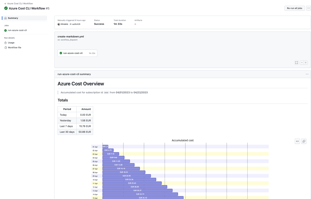
This is what the end result is supposed to be:
Problem
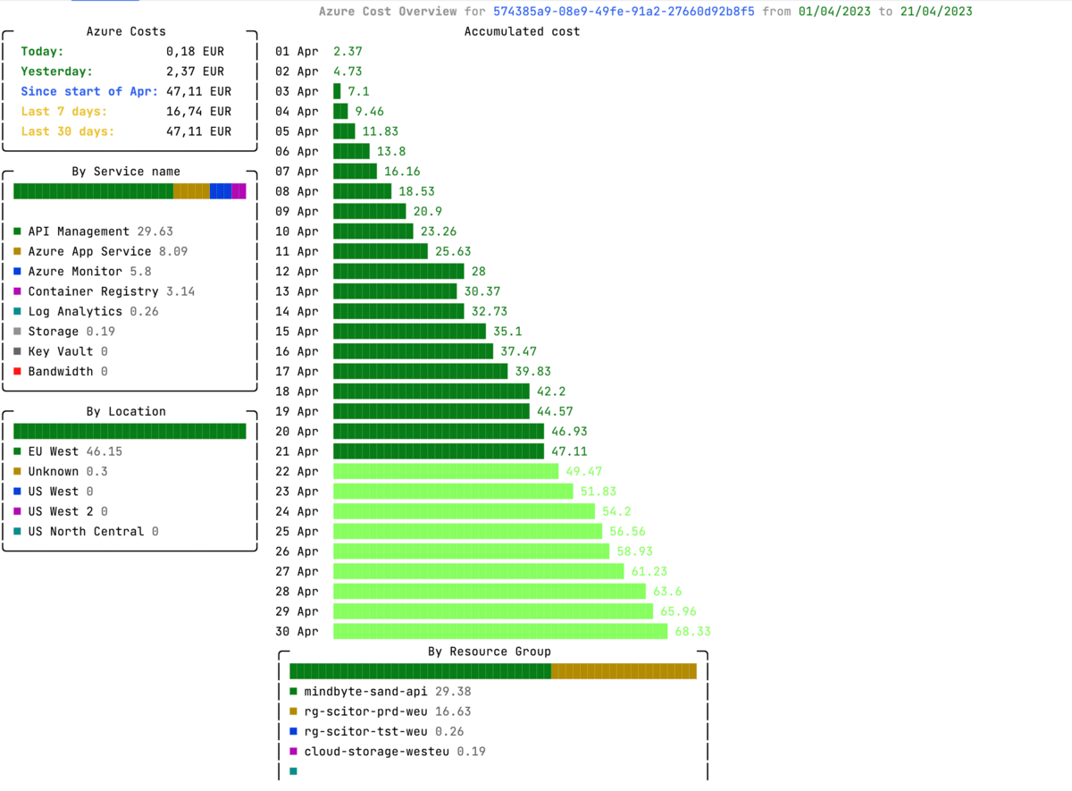
So why do I want to output markdown with mermaid in a GitHub Action? Well, as the creator of the Azure Cost Cli, I needed a way to output data from an Azure subscription in a graphical way without having to create images manually. In this tool, I collect the actual cost and forecasted cost from the Azure Cost API. So while the tool allowed for outputting data in simple tables using the markdown formatter, I also wanted to show the data more graphically.
BTW; In addition to the markdown formatter, I also have a Console version. Using the excellent spectreconsole library, it shows a similar graph in the console and I wanted something similar in Markdown as well.
MermaidJS
Creating Markdown is not that difficult; it is text after all, but creating a graph involves more work. So what if you could use a special syntax in markdown and use it to render data. Enter MermaidJS…
MermaidJS is a powerful tool for creating and modifying diagrams and charts dynamically. The purpose of Mermaidjs is to enable users to create easily modifiable diagrams that can be stored alongside the code they refer to, and rendered automatically.
One of the biggest benefits of Mermaidjs is that it allows you to create and modify diagrams directly in Markdown, using simple text definitions. This means that you can easily create, modify and update diagrams alongside your code, without the need for external tools or plugins.
Mermaidjs supports various diagram types, including flowcharts, sequence diagrams, state diagrams, Gantt charts, and pie charts. These diagrams are particularly helpful for documentation and communication, providing a visual way to explain complex ideas and processes.
For our purpose, I will focus on two types of charts: the pie chart and the Gantt chart.
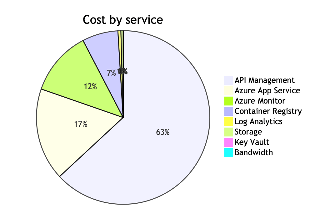
Pie Chart: The pie chart is a simple chart that can be easily created using MermaidJS. Here’s an example:
  '''mermaid
  pie
    title Cost by service
    "API Management" : 32.09
    "Azure App Service" : 8.76
    "Azure Monitor" : 6.12
    "Container Registry" : 3.40
    "Log Analytics" : 0.28
    "Storage" : 0.21
    "Key Vault" : 0.00
    "Bandwidth" : 0.00
  '''
Which is rendered to this:
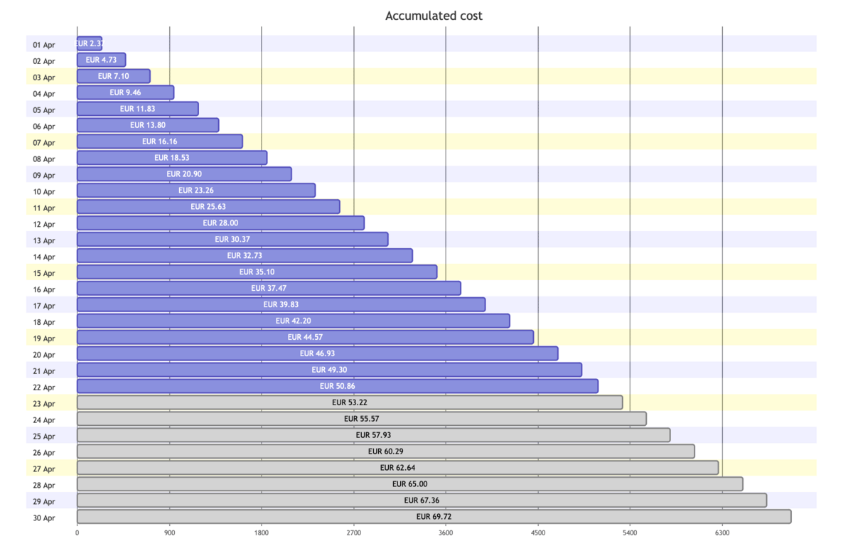
So far, it is pretty simple. However, there is no bar chart component in MermaidJS, meaning we need to use something else; the gantt chart. The Gantt chart is a more complex chart that can be used to display data over a period of time. In this case, we’ll be using it to render a barchart. Here’s an example of the markdown code:
  '''mermaid
  gantt
    title Accumulated cost
    dateFormat  X
    axisFormat %s
    section 01 Apr
    EUR 2.37 :0, 237
    section 02 Apr
    EUR 4.73 :0, 473
    section 03 Apr
    EUR 7.10 :0, 710
  // snip
    section 23 Apr
    EUR 53.22 : done, 0, 5322
    section 24 Apr
    EUR 55.57 : done, 0, 5557
    section 25 Apr
  // snip
    section 30 Apr
    EUR 69.72 : done, 0, 6972
  '''
In a gantt chart, we normally have sections with tasks indicating a certain order of events. In our case, the sections will become the headers, so the date of the data point and the value indicates the length of the bar. By setting the first value to 0, we ensure left alignment of the bar.
The dateFormat and axisFormat are set to use the UNIX timestamp format. That gives us the option to use raw values.
We also want to differentiate between actual and forecasted cost, so by adding the done marker, we get a different color. Let’s see some code!
Console.WriteLine();
Console.WriteLine("```mermaid");
Console.WriteLine("gantt");
Console.WriteLine("   title Accumulated cost");
Console.WriteLine("   dateFormat  X");
Console.WriteLine("   axisFormat %s");

var accumulatedCost = costs.OrderBy(x => x.Date).ToList();
double accumulatedCostValue = 0.0;
foreach (var day in accumulatedCost)
{

    double costValue = day.Cost;
    accumulatedCostValue += costValue;

    Console.WriteLine($"   section {day.Date.ToString("dd MMM")}");
    Console.WriteLine($"   {currency} {Math.Round(accumulatedCostValue, 2):F2} :0, {Math.Round(accumulatedCostValue* 100, 0) }");
}

var forecastedData = forecastedCosts.Where(x => x.Date > accumulatedCost.Last().Date).OrderBy(x => x.Date)
            .ToList();

foreach (var day in forecastedData)
{
    double costValue = day.Cost;
    accumulatedCostValue += costValue;
    Console.WriteLine($"   section {day.Date.ToString("dd MMM")}");
    Console.WriteLine($"   {currency} {Math.Round(accumulatedCostValue, 2):F2} : done, 0, {Math.Round(accumulatedCostValue* 100, 0) }");
}

Console.WriteLine("```");
Job Summaries in GitHub Action
GitHub Actions is a powerful and flexible automation platform that can help streamline your software development process. One of the key features of GitHub Actions is the ability to define custom workflows that automate common tasks such as testing, building, and deploying your code. These workflows can be defined using YAML files, and can include a variety of actions that perform specific tasks.
One helpful feature of GitHub Actions is the ability to generate Job Summaries for each job that is run. Job Summaries are a quick and easy way to see an overview of the results of a particular job, including any logs or artifacts that were generated. They can be customized to include additional information, such as test results or performance metrics, and can even include custom Markdown content. Combined with the feature of GitHub that it natively converts MermaidJS in a markdown file to an image, we can use Job Summaries to render the output.
First, we need a workflow file. Besides downloading and installing the tool, it needs to log in to Azure and execute the command to output markdown.
name: Azure Cost CLI Workflow

on:
  workflow_dispatch:
    inputs:
      az-subscription-id:
        description: 'Azure Subscription ID'
        required: true
jobs:
  run-azure-cost-cli:
    runs-on: ubuntu-latest
    steps:
      - name: Azure Login
        uses: azure/login@v1
        with:
          creds: ${{ secrets.AZURE_CREDENTIALS } }

      - name: Install Azure Cost CLI
        run: dotnet tool install -g azure-cost-cli --no-cache

      - name: Run Azure Cost CLI
        run: azure-cost -o markdown --subscription $ >> $GITHUB_STEP_SUMMARY
In the last step, we pipe the result of the azure-cost command to the special GITHUB_STEP_SUMMARY variable. This is actually a filename that will be picked up by the build when completed.
Put this workflow on a schedule, and you get a daily/monthly view of the data. Of course, there are many other use cases where you output something like test results, reporting data, logs etc.
Conclusion
In conclusion, using MermaidJS to generate diagrams and charts dynamically in your markdown files can greatly enhance your documentation and make it more visually appealing. Additionally, using GitHub Actions Job Summaries to display custom Markdown content on your job run summaries allows for even more flexibility in how you present your data.
By combining these two powerful tools, you can create informative and engaging documentation with ease. Whether you are working on a personal project or a large-scale enterprise application, incorporating MermaidJS and GitHub Actions Job Summaries can help you streamline your workflows and improve your overall productivity.


Leave a comment